


The Client
Holland Partner Group work with world-class lifestyle experience designers, architects, interior designers, sustainable consultants, landscape artists, and technologists to conceive exceptional new residential communities and transform existing properties to speak to the most discerning tastes and emotional needs.
Basically, they are the maestros behind luxury residential development. They decided their hardworking employees deserved a break from building dreams and opted for a company event, Camp Holland.

The Goal
To appreciate hardworking employees in the most luxurious way possible, celebrate company success and growth, and create a fun, educational environment where team building is just a slightly sarcastic adventure.


Brand Development & Research
After extensive research on the perfect marshmallow roasting techniques, I dove into the world of upscale camping, where tents have WiFi and the campfires have charisma. The challenge? Maintain the company culture, current branding, and the aura of exclusivity while embracing the great outdoors (from a carefully curated distance).


Early Concepts
Initial brainstorming involved concepts that echoed "sophisticated fun." The client requested a streamlined look that maintained brand consistency, but also showcased the adventurous and laid back personality of the event. Inspiration was pulled from kids summer camp signs, state park signage, and forestry logos and patches. The initial concepts included the recognizable Holland "H," Holland Gold and various simplistic, easily recognizable outdoor icons.
The Solution


THE LOGO
A simply sophisticated design combining the rugged charm of a tent with the recognition and corporate allure of the Holland 'H.' The main icon is en(compass)ed in a circle, guiding you through the wilderness of company growth and keeping Holland at the core.
BRAND GUIDELINES
Because even in the wild, one must adhere to the guidelines. Fonts were selected with the precision of a forest ranger plotting a trail.


Custom Icons: Designed to complement the brand, custom icons added a playful touch. Guidelines outlined their incorporation, ensuring a harmonious visual language.
Photography: Strategic guidelines for photography selection aligned visuals with the brand's narrative. Emphasis on capturing warmth and connection enriched the overall visual experience.
Logo Application Samples: Visual aids showcased correct logo applications across diverse materials, offering a practical reference for maintaining brand integrity.
Logo Usage and Spacing: Detailed guidelines on the correct usage of the logo ensured a consistent and professional presentation. Spacing considerations maintained visual balance across diverse applications.
Typography: The chosen fonts spoke the language of the brand—sophisticated yet approachable. Clear guidelines were provided for headline and body text, maintaining readability across all mediums.
Colors: A curated palette blended warmth with sophistication, resonating with Holland Partner Group's identity. Specific color codes and applications were detailed, fostering brand recognition.

YEARBOOK
Autographs, memories, and a nostalgic tribute to past glories. The perfect coffee table book for when executives want to reminisce about that one time they successfully navigated a trust fall. (put something that actually was pictured) the guidelines. Fonts were selected with the precision of a forest ranger plotting a trail.


PRINT MATERIALS
Pocket Folders: Elegantly designed pocket folders served as personalized event companions, seamlessly holding informational materials, schedules, and more. The sleek design embodied sophistication while providing practicality.
Table Tents (Vendor Display): Sleek table tents featuring vendor names and logos added a touch of flair to every table. These tents not only showcased sponsors but also facilitated seamless navigation.
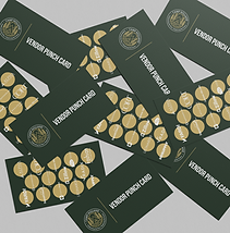
Punch Cards: Playful and interactive punch cards added a layer of engagement. Attendees received punches for each vendor visit, transforming the event into a memorable journey with incentives for exploration.


Attendee Questionnaire: A thoughtful questionnaire encouraged attendee interaction, capturing valuable insights for future events. With a user-friendly design, it facilitated feedback collection while maintaining a professional and engaging appearance.
Thank You Cards: Expressing gratitude, custom-designed thank-you cards extended appreciation to all attendees. The cards doubled as a keepsake, featuring event highlights and ensuring a lasting positive impression.
Standing Signage (Motivational/Directional): Multi-functional standing signage acted as event guides, inspirational pieces, and directional markers. Imbued with motivational quotes, they added flair to the surroundings while ensuring a seamless flow throughout the venue.
Summary
By meticulously crafting brand guidelines and a diverse array of print materials, the expectations set by Holland Partner Group were not only met but exceeded. The seamless fusion of sophisticated elements with a touch of playfulness embodied the essence of Camp Holland, creating an atmosphere that resonated with the company's values and objectives. This endeavor showcases the dedication to translating conceptual visions into tangible, impactful experiences. As the attendees navigated the event with enthusiasm, the success of Camp Holland underscored the power of strategic branding in transforming corporate occasions into vibrant, memorable affairs.
Camp Holland turned a group of property professionals into the camp counselors of corporate fun. The result? Employees felt appreciated, the company's success was celebrated, and of course, the marshmallows were roasted to perfection.